Wow it's already been 3 months since my last post. Time is moving entirely too fast these days. I get distracted with work at and it feels like a whole week has flown by without any recollection of its passing. Which is why I need something to pull me away from the daily grind every once in a while and recharge. And the TAD Summer Workshop did exactly that.
In the first week of July I flew out to Kansas City, Missouri and spent the next 3 weeks working alongside some incredible students and instructors. For week 1 Anita Kunz was the visiting artist and she assigned us with our first project: create a conceptual portrait of a well-known public figure as if it were commissioned by Rolling Stone magazine.
I had fun working on this one. I've been reading/listening to quite a few books and interviews with Stephen King lately. I'm realizing that a lot of my personal work leans towards darker, more thematic tones and who better to learn from than the king of horror? But what he said in a recent interview was very telling and mirrored what I think a lot of us as artists think about from time to time. He admitted that he wasn't sure if he would still have a loyal readership long after his passing. He referenced Tolkien and how his books are passed down generation to generation. But King isn't as confident that his books will maintain that same sort of longevity.
I just found it interesting that even the proverbial "King" of horror can't escape that gnawing feeling of self-doubt.
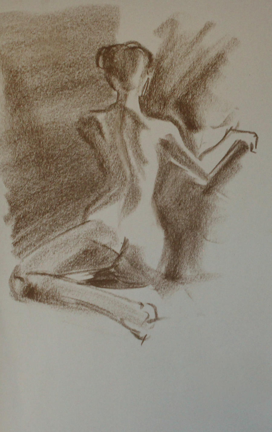
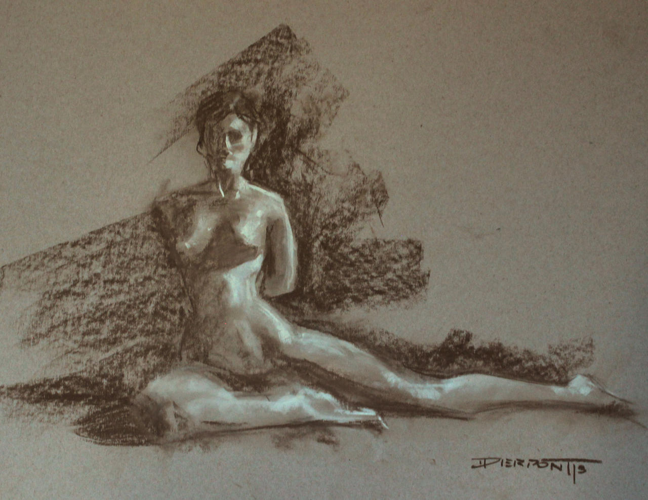
On Tuesdays and Thursday evenings we had figure drawing from 7-9pm. I can't really explain how important that was for me to be back in figure drawing sessions. Myself and a few others fought to have figure drawing re-instated at my alma mater, but to no avail. And for the last 2 years I've had a tough time trying to find a place that offers free figure sessions. But the workshop gave me a chance to, at least in part, get back to figure study with good ol' charcoal, pastel and paper :)
For week 2 we had Mr. Jon Foster dropped in and had us paint a monochromatic portrait of Captain Ahab from Moby Dick. Jon was such a cool dude. Extremely humble and easy to talk with. My roommate John Pacer and I along with Mike Slaton had a chance to pique his brain a bit about the illustration industry over dinner one night at the hotel. Jon gave us all a bit of insight and professional experience about what to seek out and what to avoid in the commercial world. Good stuff.
It our third and final week Francis Livingston stopped by the studio and gave us our third and final project: a traditional landscape/cityscape painting of the surrounding area (West Bottoms). I went out and shot photo reference with the TAD crew on two separate occasions; once in the late afternoon and once during the golden hour. I'm always fascinated with how light interacts with its environment under specific conditions. Here's a few pics that interested me from the shoot.
By the time I got back to the studio I narrowed down my composition selection to a handful of images that I felt had potential. I really wanted to go for a nice widescreen format to push the cinematic aspect of the final piece. As an entertainment designer, I'm always interested to see how I can make my images feel like they were pulled straight out of a movie and/or video game.
In the end I ended up going with the top image. I loved how there was just a slice of light pouring through the alleyway dropping everything else by contrast into cool tones. I just made a mental note to widen the light shaft a bit and add some red accented windows to the far building. Once my thumbnails were approved I transferd the drawing onto the final canvas (12" x 24") and got to work! It had been nearly 3 years since I had played around with an oil landscape and I have to admit, it was a nice respite from the typical digital work I normally do.
Overall I was really happy with the outcome and I'd love to do more of these as weekend side-projects in the future. Keep you all posted!
In between assignments I would take breaks and work on personal stuff or just wind down in my sketchbook. I must admit, I don't keep up with my sketchbook work on a daily basis so it was a lot of fun for me to not worry so much about the outcome and just go at it with inks and pens. There was a cat that had been watching me for a while while I sketched the dumpsters out back. It eventually jumped up on one of the garbage lids and started posing for me, haha. Cute cat.

This a WIP crop and initial thumbnail of what I intend to use for the first demonic entity we encounter in my Precipice story. It had been a while since I had done much personal work and it felt good to get something twisted out of my system. As far as the design goes, the goal here is to get people asking questions about the character, rather than just accept the being as a typical hellish force. I'm working out back-stories and lore for each of these figures and over the course of the project we'll get a chance to find out why they look and act they way they do and the circumstances that led to their appearance.
To completely counteract the dark stuff I started thinking about a potential pinup series that could be fun to work on. I've been seeing a few of Alex Negrea's drawings lately and the guy just knows how to handle line weight. I've personally found, when it comes to portraits, it's just easier for me to work with values in certain spots as opposed to line. Painting them seem to be much more natural for me than drawing. Which is why Alex's work has been so helpful lately; picking apart how he goes about constructing the forms with thick-to-thin line weight. It's good stuff. So I think I want to take this into a series called "Pinned". Classic pinup themes with an alternative twist, a-la Suicide Girls. We'll see.


