

Tuesday, November 13, 2012
Tuesday, October 16, 2012
October Update
Well everyone. CTNx is exactly one month away and I JUST sent off my portfolio for recruitment opportunities last night. Made a few additions to my website: www.dylanpierpont.com I still have some polishing here and there on a few pieces but we'll be good and ready come November. Still gotta take care of new biz cards and a portfolio book.
In the meantime, I'm working to crank out 2 new tutorials, one written for my Precipice enviro:

And one video time lapse for the New Era image I've been posting about. Speaking of which, NE has been posting shots from the recent events on the east coast! Looks like things have been going well and the work is getting seen. Here's one I managed to nab off their site of a few patrons checking out my piece (from this angle you can even see the ONE seam where I accidentally offset the image about 1/4" on the downed phonebooth)

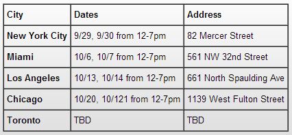
Click to check out more shots from New York and Miami. The Los Angeles gallery wrapped up this past weekend so flicks should be posted on NE's site soon. This coming weekend it's onto Chicago at the Mars Gallery on 1139 W Fulton St. I think I'll have a few family members headed that way then so hopefully I can steal a few shots they might take in-person.
Also, in case you missed it, my buddy Grant Griffin beat out the competition for Ubisoft's Assassins Creed 3 art contest. Head on over to his blog and give the man mad props. Great piece of work https://twitter.com/assassinscreed/status/258061227165622272/photo/1
That's all I got for now. Take care everyone!
-D
Saturday, September 29, 2012
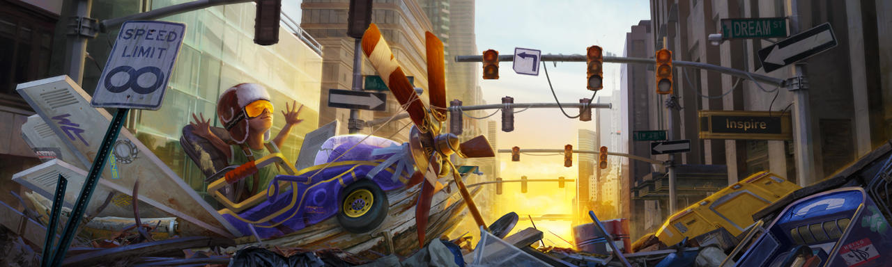
Hey everyone. Just got results back from New Era about the 'Introducing' contest. I teased at this a while back but it looks like my entry will indeed be included on their North American gallery tour. Awesomesauce! But for those of you who don't know yet let me explain....
Earlier this spring, New Era hat company put on their annual "Introducing" showcase. 100 artists were chosen from a group of applicants to pimp out a blank 59/50 cap. Of those 100, 80 were selected to go on a North American gallery tour. Here's a shot of the illustration I made...
...and process video I cut together as part of my entry
http://www.youtube.com/watch?v=qXi4TpC4Blw&feature=youtu.be&hd=1
These are weekend (Saturday/Sunday) events so feel free to come down and take a look. In fact I strongly encourage it because I don't live near any of these spots! So it'd be cool to see/hear what you guys think of it all. I'll internet high-five anyone who sends me pictures ;)
It looks like NE posted a video of the NYC space already. Looks pretty sweet. Thanks everyone!
Monday, July 23, 2012
Bone White
For the past couple months I've been having a mental block when it comes to an artist's use of white. I feel like I understand the importance of controlling both white and black and most of that comes from my educational background. "Nothing is pure white or black, remember that!" And for the most part that's true. So I learned to mix some color into opposite ends of the value scale to add "richness" and "flavor" to my work. And I gotta say, it's quite pleasing to paint without the extremes.
BUT!! I can't help but notice the works of art created by amazing creative people that manage to push good ole" #FFFFFF into their images. Now granted, there ARE times when absolute white is acceptable. Sometimes it's dependent on the surface material or the strength of the light source. Sometimes it's used to push and pull values against adjacent tones so as to separate forms. But there are times when I'm completely taken aback at a certain piece and just how WELL white was used to punctuate an area. So I ask myself how and why the artist chose to render pure white in said area and often times I can find an answer. 9 times out of 10 were it my piece I would have held off and softened that glaring daub of light. But...there it is, plain as day...and it works.
Let me try and show some examples of what I mean:
Below are a selection of images with relatively strong lighting (now before you get all technical on me remember I said "relative".) For example the image of the pirate-looking fellow in the bottom left is holding a torch. This, being the light source, is naturally the brightest spot on the page. So yes, the center of the torch hits a pure white area. The white beard however does not. The light of the torch dissipates and as such his his fluffy facial hair might hit a very bright yellow but not pure white. In the Magic: The Gathering image called "Mentor of the Meek" by Johannes Voß and Jana Schirmer there is again, a pure white light source with bright-yet-duller highlights on the swordsman. In the upper right environment by Maxim Revin called "Balieve" there is a strong out of frame light coming from the right that's shining over a gray metallic/stone path leading our eye towards the structure in the distance. Even the brightest foreground value here never reaches pure white.


So! I'm asking you all. When, if ever, do you decide to get all bone-white with your work?? Remember, I'm not talking about highly reflective materials like glass or metal. And I'm not referring to the light source itself. I'm talking when and how do you chose to use pure white for your highlights on a matte/non glossy surface material?
BUT!! I can't help but notice the works of art created by amazing creative people that manage to push good ole" #FFFFFF into their images. Now granted, there ARE times when absolute white is acceptable. Sometimes it's dependent on the surface material or the strength of the light source. Sometimes it's used to push and pull values against adjacent tones so as to separate forms. But there are times when I'm completely taken aback at a certain piece and just how WELL white was used to punctuate an area. So I ask myself how and why the artist chose to render pure white in said area and often times I can find an answer. 9 times out of 10 were it my piece I would have held off and softened that glaring daub of light. But...there it is, plain as day...and it works.
Let me try and show some examples of what I mean:
Below are a selection of images with relatively strong lighting (now before you get all technical on me remember I said "relative".) For example the image of the pirate-looking fellow in the bottom left is holding a torch. This, being the light source, is naturally the brightest spot on the page. So yes, the center of the torch hits a pure white area. The white beard however does not. The light of the torch dissipates and as such his his fluffy facial hair might hit a very bright yellow but not pure white. In the Magic: The Gathering image called "Mentor of the Meek" by Johannes Voß and Jana Schirmer there is again, a pure white light source with bright-yet-duller highlights on the swordsman. In the upper right environment by Maxim Revin called "Balieve" there is a strong out of frame light coming from the right that's shining over a gray metallic/stone path leading our eye towards the structure in the distance. Even the brightest foreground value here never reaches pure white.

So the common trend I've found in the images above are a relatively strong (if not white) light source, whether depicted in-frame or not, and a softer highlight value on the focal point. The only exception I see is in Marek Okon's "Shrapnel" image of the mech suit at the top. The sword she's holding is understandably metallic with high specularity so having it reflect the same value as the light source makes sence. All of these images utilize light in a way I would normally for any of my images.....I "get" these.
But the images below throw around light in a much more pronounced fashion. First off I wan't to explain that I'm not focusing on any metal materials in these images. Like I mentioned, the properties of metal (especially polished metal surfaces) will react almost like a mirror and reflect the light source directly. So what I'm looking are all all non-metallic surfaces; skin, hair, fur, stone, etc. Take Jeff Simpson's Ezio piece for Assassins Creed. There's a strong light that's above and slightly back-lit illuminating Ezio's shoulders while another front light is filling out his mid section. virtually everything on here that hits pure white is made of metal, except for the fur on his left shoulder (our right) the same goes for rim light on his head and left arm, which is mostly a matte/leather material. Now I can see how this was needed to pop Ezio off his mid-tone background but I again feel that if I were to approach this piece I would have gone light enough to pop the character off the BG but scale in back just a bit so we never hit a solid #FFFFFF value. In Zhang Lin's cover of his comic book "Remember" there's a strong side/rim light our of frame to the right that's lighting up the character's hair and skin with, you guessed it, pure white. In Christopher Rabenhorst's image for the "Escobar Project" in the lower left, the camera is looking almost directly into the sun light that's cause a nice bloom effect about the rooftops. But the little slice of light that's pouring onto the steps ALSO hits a pure white level, though the surface material is matte stone and the relation to the light source is neither directly perpendicular nor extremely parallel. However in Sparth's "Mother Planet 2" image in the middle right, the back stone wall is directly perpendicular to the light source, so the surface will be catching as much light as possible. Fine, but it also reaches pure white status to the left of the frame. The local color of the stone appears to be a fairly high-key gray value, so obviously it will be very bright in the sunlight but why would you chose to make it SOLID white?

From what I see, images that manage to punch out their highlights tends to have a more photographic look. And depending on the image I certainly gravitate towards that aesthetic. But what I don't understand in my own work is WHEN to use this effect.
So! I'm asking you all. When, if ever, do you decide to get all bone-white with your work?? Remember, I'm not talking about highly reflective materials like glass or metal. And I'm not referring to the light source itself. I'm talking when and how do you chose to use pure white for your highlights on a matte/non glossy surface material?
Tuesday, July 10, 2012
Back to Enviro's!
Here's a little tease from my last post. I'll leave this be until I hear back, so take this as you will.


Annnddd I FINALLY have time to get back on my personal IP. I started thumbnailing out a few set designs for the general city and hospital where the story starts out. Trying to keep things fast and loose so the space reads in just a few tones but we still nail the lighting, mood and atmosphere.

From there I selected the sketch I wanted to move forward with (third row, second column) and started blocking in a basic block mesh in Google Sketchup. (which I've learned is now called Trimble Sketchup. Not sure when that happened.) Sketchup is a really easy tool you can use to quickly plot in some boxes, planes, and cylinders to act as a base structure to paint on. Once the block-in is done I imported the file into DAZ studio and used their distant and spot lights to add some thematic mood to the scene. From there I rendered out the final lighting to a .tiff file, opened it up in Photoshop and reversed engineered my perspective grid.

With my perspective grids in place I could then start sketching out the lineart and adjusting the final value scheme. This is the about the level I'll bring it for now. A lot of the grit will be added through photo textures before I do a final pass and choose a color pallet. There's still a few issues i need to address such as scale and some architectural treatments to push this into a more believable setting. But for now it's hitting most of the emotional queues I want to invoke.

As always, thanks for stopping by and I'll keep you all updated in the days to come :) Take care!
Friday, June 22, 2012
NE: Introducing
Well what do we have here.................................................................


Wednesday, June 20, 2012
Hello fellow Bloggers! Just an update to hold you over until I'm ready to release new work.
Late last year I was approached by the AD of Lightspeed Magazine about doing an interview for their Artist Showcase. Great online magazine and fantastic talent found all through their back issues. The article was officially posted in April and I can't thank J.T. and Karen Jones enough for setting this up: http://www.lightspeedmagazine.com/nonfiction/artist-showcase-dylan-pierpont/

Recently I started noticing my Rain Dance piece popping up around the interwebs. One of those sites was www.godsofart.com. So I reached out and thanked Eusebiu Oprinoiu for his kind words and free publicity. And the next morning he shot me the nicest reply and asked if I'd be interested in doing an interview for GoA. Check it out, and make sure to browse the rest of the site while you're at it. Some really inspirational works from artists all over the world: http://godsofart.com/dylan-pierpont-interview

And lastly! I'm busy working on my personal project (see character concepts below), a group project that will hopefully be announced soon enough, and a new contest; this time something a little different for me. And I'm gonna be doing all this in the next few weeks.....WITH THESE HANDS!!!

Late last year I was approached by the AD of Lightspeed Magazine about doing an interview for their Artist Showcase. Great online magazine and fantastic talent found all through their back issues. The article was officially posted in April and I can't thank J.T. and Karen Jones enough for setting this up: http://www.lightspeedmagazine.com/nonfiction/artist-showcase-dylan-pierpont/


Been helping out my girlfriends family by digging up their front lawn. Hopefully I wont drip nasty fluids all over my tablet :P
I'll keep you posted! As always, thanks for stoppin' by!
-D
Thursday, May 31, 2012
Character Color Comps
Playing around with a few different color pallets. Haven't decided which one of these to settle on yet, but I wanted to post an update just to stay fresh. More to come.


Saturday, May 19, 2012
Diablo 3 "Portrait of a Champion" Results
Just got this e.mail last night...could not be happier!!

This is insane!! Big thanks to the Blizzard team and all you guys for your kind words. Means a lot to me. Now all I gotta do is find a job....

P.S. don't forget to check out the winners page. Some amazing talent up there:
Portrait of a Champion. Big congrats to everyone involved!
Wednesday, May 9, 2012
Precipice Update & Insane Creature Video
Hey everyone! Just wanted to post up a new update to keep things somewhat current. Decided to jump back into a project I started earlier this year, (with some help with the writing from the very talented Beki) and finally got down to doing some concepts. My portfolio has been filling up with illustration work, but my passion rests with design and function. So this is why I've set aside the month of May to start knocking out some concept work to help balance out the the portfolio, creating new images for The Precipice from scratch as well as re-visiting old ideas from various Mod groups that never made it to completion.
First up is the female lead for my story. I'm not going to explain the premise just yet, but know that it touches on all the dark elements I'm naturally drawn to ;) I spent some time fleshing out the line drawings in a clear and concise manor before picking out 3 designs that I felt meshed with her personality and profession. The black and white sketches were meant as a way to see how certain costumes and value patterns would work on top of the figure. Which is why the pose is very open, to show off as much as possible in the 3/4 view while her face is somewhat concealed. I'll worry about her head styles next.


From here I'll begin doing callouts of her bag and accessories as well as nailing down the face and hair before doing a final sketch. Then I'll play with a few color options before ripping out the final render. Stay tuned!
Also. this video will pretty much blow your damn mind. Be amazed.
First up is the female lead for my story. I'm not going to explain the premise just yet, but know that it touches on all the dark elements I'm naturally drawn to ;) I spent some time fleshing out the line drawings in a clear and concise manor before picking out 3 designs that I felt meshed with her personality and profession. The black and white sketches were meant as a way to see how certain costumes and value patterns would work on top of the figure. Which is why the pose is very open, to show off as much as possible in the 3/4 view while her face is somewhat concealed. I'll worry about her head styles next.


Also. this video will pretty much blow your damn mind. Be amazed.
Also just a final note, I was approached on DeviantArt the other day about the possibility of having my Rain Dance Tutorial translated into Ukrainian and eventually Russian for another artists blog. So I'll keep you posted if/when that happens. Thanks much!
Wednesday, May 2, 2012
Diablo 3: Portrait of a Champion
Happy May to all of you! So Blizzard was doing an art contest for the infamous "Diablo 3" title that's going to be released in about 2 weeks, and I thought I'd take a crack at it. Some really fantastic and impressive entries up there so far. Had no idea how vast the Diablo fanbase was.

Was a nice and complex adventure for me that I thought merited a little explanation (and by little I mean not at all.)
So if you're interested here's the tutorial I wrote up that walks you through my process.
Thanks much!
-D
Was a nice and complex adventure for me that I thought merited a little explanation (and by little I mean not at all.)
So if you're interested here's the tutorial I wrote up that walks you through my process.
Thanks much!
-D
P.S. I did finish the Zbrush experiment that I posted earlier and threw it up on my website. But I think there's some changes I'd like to make before I start promoting that piece. I need to get the whole process into a character concept sheet rather than just two separate illustrations. Will have more concept work to show by the end of the month!
Monday, March 26, 2012
Zbrush - Day 1
So a few buddies and I have been interested in sliding Zbrush into our concept workflow. I definitely pushed it to the back of my mind for a while but there's a show coming up and I had an idea to try and illustrate this workflow in one single piece. Not entirely sure how the final chart will look but I'm excited to give it a try.

I will say though, this has been an entirely frustrating day. BUT! Once I figured out the Zspheres and which brushes do what it's actually a very relaxing way to work.

This is a crop of a much larger sculpt for the show so you can probably pick out some of the topology in this shot; because it's never meant to be seen this close and any higher subdivisions would slow up my system :/
Thanks for checking. Between the few freelance jobs I'm currently working on, the contest I mentioned in my previous post, the show coming up in two weeks and the portfolio building to be ready by the end of May I'm happy to say I'm feeling busy, tired, excited and a whole buncha other things right now!
Saturday, March 17, 2012
St. Patty's Day Post
Happy St. P's day everyone! Just to nerd out on this annual event: A Biologist's St. Patrick's Day Song
Alright back to work. There's been rumors flying around a certain contest. So here's a little crop/preview of my entry for now. Did up the color study last night and I'm really happy with where's it's going. This piece will be a nice stretch for me in terms of composition and active effects. More to come.

AND! I picked up a cheap(er) Molskine 3-pack to start scratching away in. Trying to loosen up and avoid getting so renderific. Also had a nice conversation with Grant Griffin and Matt Maloney about hands and hand gestures while going through Michael Hampton's figure drawing book. Mmmhhhhh....hhhaaannnddssss.

Tuesday, February 28, 2012
February Update: More to Come
It's been a while so I figured it's time for a new update. I've had this one posted on my website for a while now but i thought I'd share it here to set up for a huge art dump I'll have coming soon.
This concept was spawned during one of the weekly sketchgroups I do with a bunch of friends of mine. Usually we just do our own thing and work on whatever, school projects, commissions, personal sketches, etc. But this week we all decided to work off a prompt and do a re-design of classic movie monsters. I chose to do the Mummy but made an effort to design outside of the typical Egyptian setting. So I thought of other cultures around the world that mummify their dead and landed on ancient Aztec/Mayan/Incan/Central-South Americas.
This was also a little experiment for me in painting with color directly rather than glazing over a value study. It's still very mono-chromatic but I feel like I learned a bit during the process.
Thanks for checking! Should have a new video tutorial and a host of new images to show soon enough!
Subscribe to:
Posts (Atom)