Definitely need to spend more time figuring out what exactly this characters helmet will look like. It going to be a nice selling point so we're going to have to go through some design callouts and nail this one. I'm also going to need to spend more time understanding the value shifts in this area. I'm thinking my best best is to render each metalic surface as though it's brand new and highly polished before layering the grit and grime and doing a final paint pass to make everything feel worn. But as-is those highlights and shadow tones are completely off :/
I'm trying to mash classical gladiator with a Siberian setting (see Nissa character post below) so there's elements I need to drop and some I need to incooperate so these two characters look like they belong in the same universe. Right now I think they feel a bit detached from one another design-wise. BUT! I'll make sure to pull them both back together in the final stages.
Tuesday, May 31, 2011
Saturday, May 28, 2011
Alley Quick Sketch
Another environment paint over. Started last week with a few 3 minute warm ups to figure out composition. Showed these to the SPRAWL guys and from there Adam provided me with a basic 3D screen from the current level build. To push myself and avoid noodling around with details, I made sure to 1) save any photo crops for later in the process and 2) stop finished or not at just over 2 hours to see how far I could get.
I went through Dylan Cole's Gnomon matte video again (i think the last time was well over a year ago) to better understand indicating detail quickly and efficiently. I've had issues in the past trying to figure out how concept artists construct urban landscapes that are so heavy in detail. But after going through both Dylan and Feng Zhu's methods I see now it's really just a TON of various mark-making with photos used to support the overall structures.
I guess my underlying goal here was to see how well I could communicate an urban setting without the use of photo crop and in a relative time crunch. Hopefully I hit that mark, if not at least landed somewhere close. Haha.
Also, came back from Kung Fu Panda 2 tonight. If you haven't see it already drop everything you're doing and get to the theaters.....now!!
I went through Dylan Cole's Gnomon matte video again (i think the last time was well over a year ago) to better understand indicating detail quickly and efficiently. I've had issues in the past trying to figure out how concept artists construct urban landscapes that are so heavy in detail. But after going through both Dylan and Feng Zhu's methods I see now it's really just a TON of various mark-making with photos used to support the overall structures.
I guess my underlying goal here was to see how well I could communicate an urban setting without the use of photo crop and in a relative time crunch. Hopefully I hit that mark, if not at least landed somewhere close. Haha.
Also, came back from Kung Fu Panda 2 tonight. If you haven't see it already drop everything you're doing and get to the theaters.....now!!
Friday, May 20, 2011
Life Painting Progress Shot
It's been fun getting back into oil painting for the last couple weeks. Our models have been fun to work with and the costuming is better than anything we've done in the past. I spent the majority of Wednesdays session working out the face. Still not quite there but we're making progress. The model expressed an interest in purchasing this work once it's finished. She said it would be a nice gift for her mother and one where she was actually clothed, haha. So hopefully we can do it justice by the end ;)
In the meantime I think I'm going to knock out the clothing/torso region this weekend. I took photo's but haven't bothered using them because working from life feels so much more gratifying. That, and various other projects have taken up my weekend hours so the painting is usually saved for our Wednesday class.
18"x24" Oil on Masonite.
In the meantime I think I'm going to knock out the clothing/torso region this weekend. I took photo's but haven't bothered using them because working from life feels so much more gratifying. That, and various other projects have taken up my weekend hours so the painting is usually saved for our Wednesday class.
18"x24" Oil on Masonite.
Monday, May 16, 2011
Nissa
For my Computer Illustration II class, our first assignment is to illustrate 2 characters. The first is some sort of protagonist and the second is the antagonist. The focus is to practice rendering a certain type of material ie: fur, scales, skin, etc. But I've started to see over the years analyzing character designs for entertainment, hell even watching people around me, good design tends to incorporate a variety of surface materials in one outfit.
So I've decided to challenge myself a bit and push a few of these elements into both characters. The story I came up with involves a frozen landscape (I'm thinking Siberian plains) with a gladiator theme. The protagonist is some sort of female warrior and her opponent.....is yet to be determined.
Initial gestures and a semi-finished sketch of Nissa. Too tired to mess with hands and feet tonight :P
So I've decided to challenge myself a bit and push a few of these elements into both characters. The story I came up with involves a frozen landscape (I'm thinking Siberian plains) with a gladiator theme. The protagonist is some sort of female warrior and her opponent.....is yet to be determined.
Initial gestures and a semi-finished sketch of Nissa. Too tired to mess with hands and feet tonight :P
Already started thinking of a color scheme/rendering style so I'm hoping this all pulls together fairly well for the final piece. Getting pretty excited :)
Sunday, May 15, 2011
New Post For Old Work
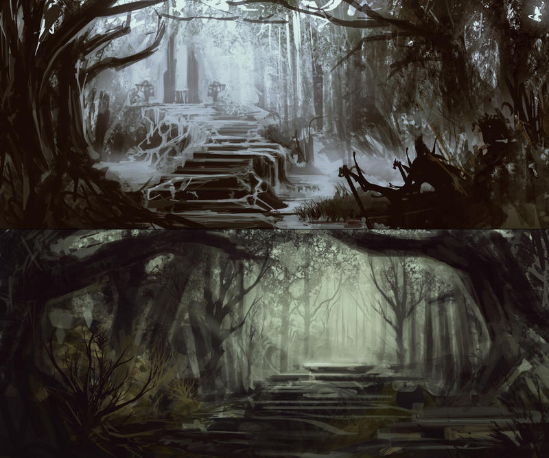
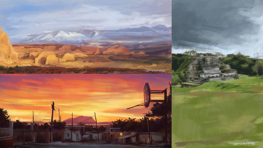
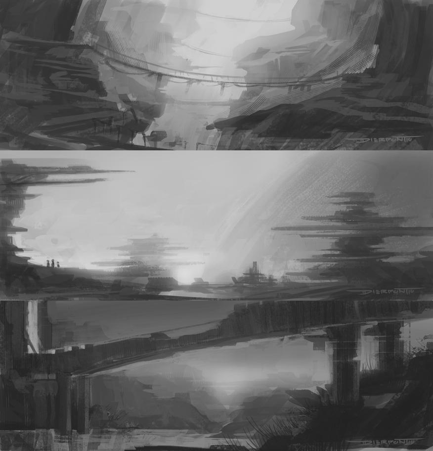
Wanted to share some older studies that I haven't posted here before. All environment related, sketches and color keys some reffed and some without.
These were some basic warm ups for a project I was fortunate enough to be apart of with Raul Ramos, Brent Pickrell, Stephen Ehrman and Jayson Miller. It didn't make it quite as far as we would have hoped but it definitely gave us all an insight into communication and working in a pre-production pipeline. I have a few other pieces from that time that I'l post in the coming months.
First set was 20 minutes a piece, second set took 45 min - 1hr.
These were some basic warm ups for a project I was fortunate enough to be apart of with Raul Ramos, Brent Pickrell, Stephen Ehrman and Jayson Miller. It didn't make it quite as far as we would have hoped but it definitely gave us all an insight into communication and working in a pre-production pipeline. I have a few other pieces from that time that I'l post in the coming months.
First set was 20 minutes a piece, second set took 45 min - 1hr.
These were some weekend studies based off various photos I found scouring through my friends Facebook photo albums. The video time lapse can be seen here.
This next set was fun to experiment with. A while ago I decided to fill 2 pages in my Moleskine with nothing but black and white environment thumbs. It was a quick way to practice composition and break down the value patterns into fundamental shapes. From that list I picked off a handful and spent 30 minutes or so laying in values and playing with the lighting. Definitely learned a lot working with these.
Subscribe to:
Posts (Atom)