Saturday, August 3, 2013

Summer 2013 Update

Wow it's already been 3 months since my last post. Time is moving entirely too fast these days. I get distracted with work at and it feels like a whole week has flown by without any recollection of its passing. Which is why I need something to pull me away from the daily grind every once in a while and recharge. And the TAD Summer Workshop did exactly that.

In the first week of July I flew out to Kansas City, Missouri and spent the next 3 weeks working alongside some incredible students and instructors. For week 1 Anita Kunz was the visiting artist and she assigned us with our first project: create a conceptual portrait of a well-known public figure as if it were commissioned by Rolling Stone magazine.

I had fun working on this one. I've been reading/listening to quite a few books and interviews with Stephen King lately. I'm realizing that a lot of my personal work leans towards darker, more thematic tones and who better to learn from than the king of horror? But what he said in a recent interview was very telling and mirrored what I think a lot of us as artists think about from time to time. He admitted that he wasn't sure if he would still have a loyal readership long after his passing. He referenced Tolkien and how his books are passed down generation to generation. But King isn't as confident that his books will maintain that same sort of longevity.

I just found it interesting that even the proverbial "King" of horror can't escape that gnawing feeling of self-doubt.


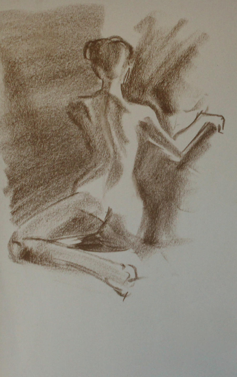
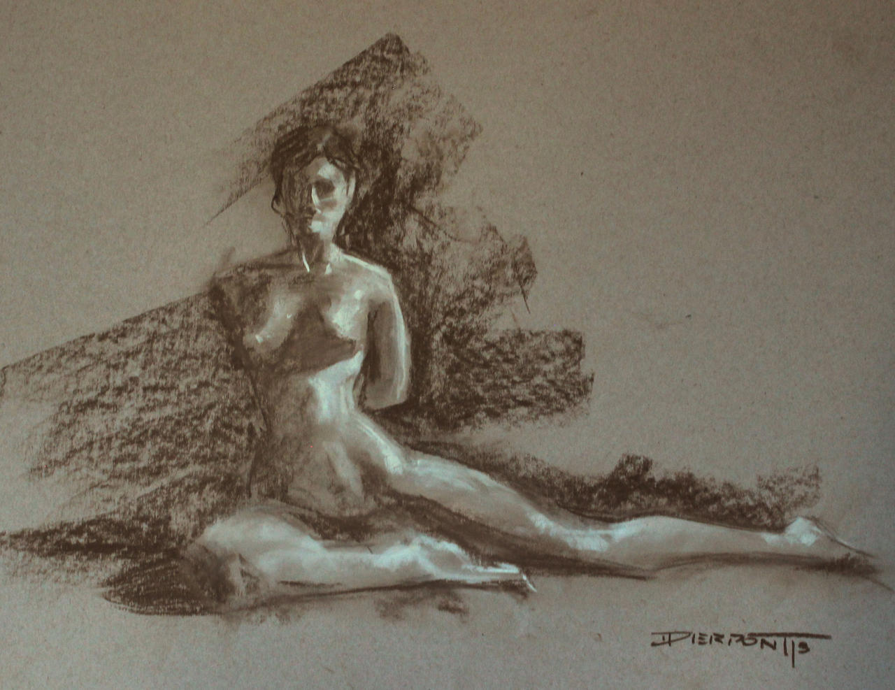
On Tuesdays and Thursday evenings we had figure drawing from 7-9pm. I can't really explain how important that was for me to be back in figure drawing sessions. Myself and a few others fought to have figure drawing re-instated at my alma mater, but to no avail. And for the last 2 years I've had a tough time trying to find a place that offers free figure sessions. But the workshop gave me a chance to, at least in part, get back to figure study with good ol' charcoal, pastel and paper :)


For week 2 we had Mr. Jon Foster dropped in and had us paint a monochromatic portrait of Captain Ahab from Moby Dick. Jon was such a cool dude. Extremely humble and easy to talk with. My roommate John Pacer and I along with Mike Slaton had a chance to pique his brain a bit about the illustration industry over dinner one night at the hotel. Jon gave us all a bit of insight and professional experience about what to seek out and what to avoid in the commercial world. Good stuff.


It our third and final week Francis Livingston stopped by the studio and gave us our third and final project: a traditional landscape/cityscape painting of the surrounding area (West Bottoms). I went out and shot photo reference with the TAD crew on two separate occasions; once in the late afternoon and once during the golden hour. I'm always fascinated with how light interacts with its environment under specific conditions. Here's a few pics that interested me from the shoot.


By the time I got back to the studio I narrowed down my composition selection to a handful of images that I felt had potential. I really wanted to go for a nice widescreen format to push the cinematic aspect of the final piece. As an entertainment designer, I'm always interested to see how I can make my images feel like they were pulled straight out of a movie and/or video game.


In the end I ended up going with the top image. I loved how there was just a slice of light pouring through the alleyway dropping everything else by contrast into cool tones. I just made a mental note to widen the light shaft a bit and add some red accented windows to the far building. Once my thumbnails were approved I transferd the drawing onto the final canvas (12" x 24") and got to work! It had been nearly 3 years since I had played around with an oil landscape and I have to admit, it was a nice respite from the typical digital work I normally do.


Overall I was really happy with the outcome and I'd love to do more of these as weekend side-projects in the future. Keep you all posted!

In between assignments I would take breaks and work on personal stuff or just wind down in my sketchbook. I must admit, I don't keep up with my sketchbook work on a daily basis so it was a lot of fun for me to not worry so much about the outcome and just go at it with inks and pens. There was a cat that had been watching me for a while while I sketched the dumpsters out back. It eventually jumped up on one of the garbage lids and started posing for me, haha. Cute cat.


This a WIP crop and initial thumbnail of what I intend to use for the first demonic entity we encounter in my Precipice story. It had been a while since I had done much personal work and it felt good to get something twisted out of my system. As far as the design goes, the goal here is to get people asking questions about the character, rather than just accept the being as a typical hellish force. I'm working out back-stories and lore for each of these figures and over the course of the project we'll get a chance to find out why they look and act they way they do and the circumstances that led to their appearance.


To completely counteract the dark stuff I started thinking about a potential pinup series that could be fun to work on. I've been seeing a few of Alex Negrea's drawings lately and the guy just knows how to handle line weight. I've personally found, when it comes to portraits, it's just easier for me to work with values in certain spots as opposed to line. Painting them seem to be much more natural for me than drawing. Which is why Alex's work has been so helpful lately; picking apart how he goes about constructing the forms with thick-to-thin line weight. It's good stuff. So I think I want to take this into a series called "Pinned". Classic pinup themes with an alternative twist, a-la Suicide Girls. We'll see.


Last but not least I want to show you all a few people that I met out in KC. I loved every minute I spent out there and the group made it all worth while. Check 'um out:

Alex Hill: http://alexhillart.com/
John Pacer: http://www.johnpacer.com/
Rachelle Fields: http://rachellefields.com/
Ellen Barkin Söderholm: http://www.fineartsandillustration.com/
Maggie Ivy: http://maggieivy.com/
Cody Shank: http://shownd.com/CodyShank
Mike Slaton: https://plus.google.com/103320357275561764500/posts
Andy Brinkman: http://brnkblog.tumblr.com/
Darren Kennedy: http://dkdelicious.deviantart.com/

Thanks for stopping buy everyone! I have a few more (candid) pics to post from the workshop in due time, but until then, stay classy internets ;)

P.S. I should also mention that I recently made a Facebook page for my artwork. I'm not going public with it until a few of these NDA's are lifted. But feel free to hop on over and give it a 'like' if you got a minute: https://www.facebook.com/dylanpierpontart

-Dylan


Wednesday, May 8, 2013

School, work, study. Rinse and repeat

Oh man. I let this sit for far too long. Time to get caught up.

Before I get too far into the update, let me just throw out a few new links to portfolio sites I started up recently. Go forth and follow, my bretherin.

Behance: http://www.behance.net/DylanEP
Tumblr: http://dylanpierpont.tumblr.com/
VisualArt: http://www.visualart.me/dashboard

So! Last post I made came just before CTNx. After a 9 hour layover in San Fransisco airport I snagged a late flight out to Bob Hope and arrived Friday evening. Had a great time getting to see some old faces and meeting new ones. I managed to land an interview with BLT Communications. Big thank you to Chris, Aaron and Seren for their hospitality. Was a pleasure getting to meet you all and having the opportunity to check out all the fantastic work your team produces.

Something I realized after leaving CTNx (which almost didn't happen because I was on standby for a direct flight back to Denver) was, though the experience as a whole was rewarding, I had a hard time getting my portfolio in front of the right people. There were so many great animation studios posted up in booths and back rooms but very little in the way of game art and feature file. I also must admit that I was a little passive when it came to the after parties and such, something I'll need to improve on for the up coming Spectrum Live and Denver Comic Con events..

In December DeviantArt  hosted a contest in partnership with The Art Department for a chance to win some online classes AND a 3 week workshop over in Kansas City, MO. After a month of deliberation I was extremely fortunate to have won 1st place in the 2D Entertainment category. Check out the rest of the finalists and don't forget to click the links in each section to see the 30 runner-ups. Some really incredible work.

Those classes started up in early February and I've had a blast learning under Vanessa Lemen and Marshall Vandruff. Here's a sampling of one of my assignments for Marshall's Composition and Color Theory I class:


The goal was to take a few different emotions and represent them as abstract value compositions. And though a few of these leaned more towards the representational side of things, they were a unique way to loosen up and not think too much while your getting your hand moving.

In Vanessa's class I've been going back to my educational roots by working with oils again. It definitely hasn't been easy trying to pick up a brush after almost 2 years but the more we do the more it's all starting to come back to me:


This past assignment we jumped into digital for the first time and I used a lot of the simple techniques I've been using for my film studies to knock out this portrait out in 2.5 hours:


Something I've definitely noticed in my portrait/character design process that's become a bad habit of mine is relying too heavily on the "fix it in post" mentality. As you can see in the initial grayscale sketch some of my features were quite a bit longer and larger than they should have been. And I've grown comfortable allowing my portraits to maybe be too loose and inaccurate in the beginning stages rather than putting the correct strokes down the first time. (Another reason why I gravitate towards environments and props over figures and creatures.) Still much to learn! An artist's education is never truly finished ;)

As I mentioned above, in an effort to understand what make a piece of art feel cinematic,  I've been trying to make a habit of doing hour-long film studies based on a few of my favorite movies. These are meant to help my understanding of what makes an image feel like as though it was pulled straight from the big screen, both in color, value, and composition. I use primarily 3 brushes for all of these, but 2 (soft round and hard round) if I can help it:


Speaking of cinematic  I've continued to move forwards with my "Precipice" project. Some of you might remember the process I showed for my main character, Nastasya, a while back:


In my previous posts I talked about finishing up a full-length tutorial for the hospital environment that sets the stage for The Precipice. You can download/view the full tutorial here.


I've also been using my Visual Narrative class with Marshall as a way to further parts of The Precipice into a sequential art format. I'm working hard to finish up a 4 page comic that introduces a new character Marek and will ultimately storyboard a small segment from the project:


Facebook has become a huge source of inspiration for myself over the past 6 months or so. I wake up every morning and scroll through a feed of beautiful and awe-inspiring work from artists all over the globe. So myself, Zach Madere, and Brent Pickrell decided it was time to start a group where all our friends, classmates and colleges could share what they've been working on, ask for critique, and socialize with other like-minded individuals. Thus, The Crit Corner was born. We had our first Challenge back in April. Topic was creature and the two description words were "irradiated" and "climb":


I'll be posting the announcement for Challenge #4 shortly, so head on over and start getting involved with the Critters ;)

Last week was the opening for my first ever First Friday show down on Sata Fe. I had the distinct pleasure of showing with Grant Griffin, Jon Baker, Raul Ramos, Tom Collins, Matt Hubel, and Victor Escobedo. I'll most like still have a few small 8.5"x11" prints left over by the end of the month. I'll make sure to post photos if anyone is interested by then.

I almost forgot! A few months back I had an art test for a studio out in Hungary. Didn't manage to land the position but I had some fun working on the prompt. Will probably spend some time extra time cleaning this up before Spectrum Live next week:


Annnndddd....I think that covers it. I'll be gone for a business trip this weekend, and I'l be sure to fill you all in on how that goes. This one is a first for me so we'll see what the future holds. But for now, thanks for stopping by and have a great rest of your week!

-Dylan

Tuesday, November 13, 2012

This weekend

......I will [hopefully] be putting these cards to good use. See you all at CTNx!


Tuesday, October 16, 2012

October Update

Well everyone. CTNx is exactly one month away and I JUST sent off my portfolio for recruitment opportunities last night. Made a few additions to my website: www.dylanpierpont.com I still have some polishing here and there on a few pieces but we'll be good and ready come November. Still gotta take care of new biz cards and a portfolio book.

In the meantime, I'm working to crank out 2 new tutorials, one written for my Precipice enviro:


And one video time lapse for the New Era image I've been posting about. Speaking of which, NE has been posting shots from the recent events on the east coast! Looks like things have been going well and the work is getting seen. Here's one I managed to nab off their site of a few patrons checking out my piece (from this angle you can even see the ONE seam where I accidentally offset the image about 1/4" on the downed phonebooth) 


Click to check out more shots from New York and Miami. The Los Angeles gallery wrapped up this past weekend so flicks should be posted on NE's site soon. This coming weekend it's onto Chicago at the Mars Gallery on 1139 W Fulton St. I think I'll have a few family members headed that way then so hopefully I can steal a few shots they might take in-person.

Also, in case you missed it, my buddy Grant Griffin beat out the competition for Ubisoft's Assassins Creed 3 art contest. Head on over to his blog and give the man mad props. Great piece of work https://twitter.com/assassinscreed/status/258061227165622272/photo/1

That's all I got for now. Take care everyone!

-D


Saturday, September 29, 2012

Hey everyone. Just got results back from New Era about the 'Introducing' contest. I teased at this a while back but it looks like my entry will indeed be included on their North American gallery tour. Awesomesauce! But for those of you who don't know yet let me explain....

Earlier this spring, New Era hat company put on their annual "Introducing" showcase. 100 artists were chosen from a group of applicants to pimp out a blank 59/50 cap. Of those 100, 80 were selected to go on a North American gallery tour. Here's a shot of the illustration I made...


...and process video I cut together as part of my entry

http://www.youtube.com/watch?v=qXi4TpC4Blw&feature=youtu.be&hd=1

These are weekend (Saturday/Sunday) events so feel free to come down and take a look. In fact I strongly encourage it because I don't live near any of these spots! So it'd be cool to see/hear what you guys think of it all. I'll internet high-five anyone who sends me pictures ;)


It looks like NE posted a video of the NYC space already. Looks pretty sweet. Thanks everyone!


Monday, July 23, 2012

Bone White

For the past couple months I've been having a mental block when it comes to an artist's use of white. I feel like I understand the importance of controlling both white and black and most of that comes from my educational background. "Nothing is pure white or black, remember that!" And for the most part that's true. So I learned to mix some color into opposite ends of the value scale to add "richness" and "flavor" to my work. And I gotta say, it's quite pleasing to paint without the extremes.

BUT!! I can't help but notice the works of art created by amazing creative people that manage to push good ole" #FFFFFF into their images. Now granted, there ARE times when absolute white is acceptable. Sometimes it's dependent on the surface material or the strength of the light source. Sometimes it's used to push and pull values against adjacent tones so as to separate forms. But there are times when I'm completely taken aback at a certain piece and just how WELL white was used to punctuate an area. So I ask myself how and why the artist chose to render pure white in said area and often times I can find an answer. 9 times out of 10 were it my piece I would have held off and softened that glaring daub of light. But...there it is, plain as day...and it works.

Let me try and show some examples of what I mean:

Below are a selection of images with relatively strong lighting (now before you get all technical on me remember I said "relative".) For example the image of the pirate-looking fellow in the bottom left is holding a torch. This, being the light source, is naturally the brightest spot on the page. So yes, the center of the torch hits a pure white area. The white beard however does not. The light of the torch dissipates and as such his his fluffy facial hair might hit a very bright yellow but not pure white. In the Magic: The Gathering image called "Mentor of the Meek" by Johannes Voß and Jana Schirmer there is again, a pure white light source with bright-yet-duller highlights on the swordsman. In the upper right environment by Maxim Revin called "Balieve" there is a strong out of frame light coming from the right that's shining over a gray metallic/stone path leading our eye towards the structure in the distance. Even the brightest foreground value here never reaches pure white.


So the common trend I've found in the images above are a relatively strong (if not white) light source, whether depicted in-frame or not, and a softer highlight value on the focal point. The only exception I see is in Marek Okon's "Shrapnel" image of the mech suit at the top. The sword she's holding is understandably metallic with high specularity so having it reflect the same value as the light source makes sence. All of these images utilize light in a way I would normally for any of my images.....I "get" these.

But the images below throw around light in a much more pronounced fashion. First off I wan't to explain that I'm not focusing on any metal materials in these images. Like I mentioned, the properties of metal (especially polished metal surfaces) will react almost like a mirror and reflect the light source directly. So what I'm looking are all all non-metallic surfaces; skin, hair, fur, stone, etc. Take Jeff Simpson's Ezio piece for Assassins Creed. There's a strong light that's above and slightly back-lit illuminating Ezio's shoulders while another front light is filling out his mid section. virtually everything on here that hits pure white is made of metal, except for the fur on his left shoulder (our right) the same goes for rim light on his head and left arm, which is mostly a matte/leather material. Now I can see how this was needed to pop Ezio off his mid-tone background but I again feel that if I were to approach this piece I would have gone light enough to pop the character off the BG but scale in back just a bit so we never hit a solid #FFFFFF value. In Zhang Lin's cover of his comic book "Remember" there's a strong side/rim light our of frame to the right that's lighting up the character's hair and skin with, you guessed it, pure white. In Christopher Rabenhorst's image for the "Escobar Project" in the lower left, the camera is looking almost directly into the sun light that's cause a nice bloom effect about the rooftops. But the little slice of light that's pouring onto the steps ALSO hits a pure white level, though the surface material is matte stone and the relation to the light source is neither directly perpendicular nor extremely parallel. However in Sparth's "Mother Planet 2" image in the middle right, the back stone wall is directly perpendicular to the light source, so the surface will be catching as much light as possible. Fine, but it also reaches pure white status to the left of the frame. The local color of the stone appears to be a fairly high-key gray value, so obviously it will be very bright in the sunlight but why would you chose to make it SOLID white?


From what I see, images that manage to punch out their highlights tends to have a more photographic look. And depending on the image I certainly gravitate towards that aesthetic. But what I don't understand in my own work is WHEN to use this effect.

So! I'm asking you all. When, if ever, do you decide to get all bone-white with your work?? Remember, I'm not talking about highly reflective materials like glass or metal. And I'm not referring to the light source itself. I'm talking when and how do you chose to use pure white for your highlights on a matte/non glossy surface material?


Tuesday, July 10, 2012

Back to Enviro's!

Here's a little tease from my last post. I'll leave this be until I hear back, so take this as you will.
Annnddd I FINALLY have time to get back on my personal IP. I started thumbnailing out a few set designs for the general city and hospital where the story starts out. Trying to keep things fast and loose so the space reads in just a few tones but we still nail the lighting, mood and atmosphere.


From there I selected the sketch I wanted to move forward with (third row, second column) and started blocking in a basic block mesh in Google Sketchup. (which I've learned is now called Trimble Sketchup. Not sure when that happened.) Sketchup is a really easy tool you can use to quickly plot in some boxes, planes, and cylinders to act as a base structure to paint on. Once the block-in is done I imported the file into DAZ studio and used their distant and spot lights to add some thematic mood to the scene. From there I rendered out the final lighting to a .tiff file, opened it up in Photoshop and reversed engineered my perspective grid.


With my perspective grids in place I could then start sketching out the lineart and adjusting the final value scheme. This is the about the level I'll bring it for now. A lot of the grit will be added through photo textures before I do a final pass and choose a color pallet. There's still a few issues i need to address such as scale and some architectural treatments to push this into a more believable setting. But for now it's hitting most of the emotional queues I want to invoke.


As always, thanks for stopping by and I'll keep you all updated in the days to come :) Take care!