Wednesday, September 7, 2011

Design Dump

It's been a long time, lot's of stuff happening lately so I'll get right to it.

I'm graduated and currently working on a few projects that I'll hopefully be able to share some work for in the coming months. Until then here's some work, some old some new you might or might not recognize from a while back ;)


A fashionable warrior chick from the Siberian Plains. She gon' cut chu ;)


This idea came about after listening to Aloe Blacc's track "I Need a Dollar" http://www.youtube.com/watch?v=iR6oYX1D-0w

The premise has to do with a male character who tells tales of his travels and past lifes to the town's children for coin. Against their parents wishes, all the kids save their allowance week after week just to watch the Talesman bring his dark stories to life through his magical pipe.

Big thanks to http://victoreart.blogspot.com/ for blasting his music in Shore 101 every night and bringing about this inspiration.


Some character silhouettes studies for the day. I'm trying out different methods for creating these guys in the most efficient way possible while still maintaining a quick read. Might post more as time goes on.

Video Time lapse


Thanks for checkin'!

Friday, July 8, 2011

Custom Shapes


For a while I kept hearing about this magical new approach to building up compositions using custom shapes. The idea came from Sparth (if you don't know who that is...let's just not even go there) and for the longest time I questioned it's effectiveness. I generally like to block out big shapes and cut back in for detail. It's a process I've used for a while now to generate enviros and up until now it's worked pretty well.

The problem I kept running into was populating the scenes with detail and getting my shapes to read as I intended them. A rock didn't QUITE look like a rock unless I spent a few minutes slicing out all the cracks and chips, and it never felt quite natural. But this new approach to thumbnailing circumnavigates this two step process and cut's production time by more than half. Here's the thread you'll need to get started: http://www.conceptart.org/forums/showthread.php?t=201403

Below are a few of my first experiments.

I started with one shape and use that exclusively to build up a quick scene.


From there I altered the first shape painted over and cut back in with negative space to create a new custome shape. I used both of these in tandem to create the next scene.


Shapes alone stack and incredible amount of detail in literally no time. But using them together with stock/custom brushes has been ideal. The custom shapes work as a base to build up on top with brush strokes.


Which is exactly how I've started one of my key shots for my Comp. Illustration 2 class. Depending on how calculated to want to be with this method I can see it working both as a graphic white/black technique, or (as I plan to do) a basis for a full color painting.


SO! Just thought I'd share. I'm definitely enjoying this fast and messy method, and the results are great for the time it takes to produce. I'll see if I can't get a tutorial up once I finally do a color paintover. 

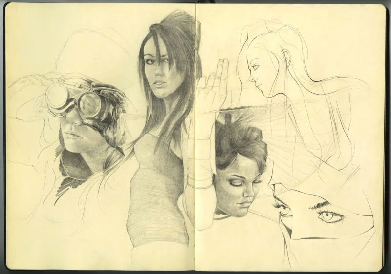
And finally broke open the new Molskine. Some renders/sketches from photo reffs.


Goggles girl and ninja lady from DA:
http://valentinakallias.deviantart.com/
http://sifu.deviantart.com/

The rest are friends of mine from high school. Some insanely talented models and one of the best photographers I know. Show her some love ;)
 
http://sinfuleyes.deviantart.com/

Have a good one!!

Sunday, June 19, 2011

Creature Designs 1st Round

Alright I can successfully say this is my first real attempt at working with creature design. Unless you count the one piece I tried when I was in 6th grade :/


Or the dragons I used to draw back in 7th and 8th grade -__-


Anyway, I guess my point is I don't spend a lot of time in this particular design arena. But Having been through a couple of these now (with some wise guidance from Sr. Ramos :) I can definitely see the appeal. These have been a blast to create and hope that shows through in some of the work.


I'll keep this space updated with any new developments for this project but for now http://www.youtube.com/watch?v=YFk2_5RkwlA

And for anyone who WASN'T at Red Rocks last night, you missed out on one HELL of a Bassnectar show. Whomp, whomp, warbly, whomp, WHOMP!! ;)


Monday, June 6, 2011

SPRAWL Building Update

Here's a progress update from the SPRAWL team. Adam shot me another screen from one of the corner blocks to flesh out a multi-complex structure. I'm superimposing the piece on top of the original screen plate. All that's left to do is get some signage scribble in some last minute details and lay down proper color. Thanks for checkin!

Thursday, June 2, 2011

Face The Truth

Beginning stages of my first project for Grad Portfolio. Haven't decided how detailed or not I want to render this for the final. Color choice might end up changing too, we'll see after critique tomorrow! It's fairly graphic not only in the saturation/intensity of the pallet but by preserving the lineart and not blocking in the moving foreground figures it has a different style to it that I'm not used to seeing in my own work. Can't say I'm a fan of it at this point, would definitely like to introduce some more naturalistic tones and flesh out the static wall structure she's leaning up against. But for now...sleep :)

Tuesday, May 31, 2011

Gladiator Progress

Definitely need to spend more time figuring out what exactly this characters helmet will look like. It going to be a nice selling point so we're going to have to go through some design callouts and nail this one. I'm also going to need to spend more time understanding the value shifts in this area. I'm thinking my best best is to render each metalic surface as though it's brand new and highly polished before layering the grit and grime and doing a final paint pass to make everything feel worn. But as-is those highlights and shadow tones are completely off :/

I'm trying to mash classical gladiator with a Siberian setting (see Nissa character post below) so there's elements I need to drop and some I need to incooperate so these two characters look like they belong in the same universe. Right now I think they feel a bit detached from one another design-wise. BUT! I'll make sure to pull them both back together in the final stages.

Saturday, May 28, 2011

Alley Quick Sketch

Another environment paint over. Started last week with a few 3 minute warm ups to figure out composition. Showed these to the SPRAWL guys and from there Adam provided me with a basic 3D screen from the current level build. To push myself and avoid noodling around with details, I made sure to 1) save any photo crops for later in the process and 2) stop finished or not at just over 2 hours to see how far I could get.

I went through Dylan Cole's Gnomon matte video again (i think the last time was well over a year ago) to better understand indicating detail quickly and efficiently. I've had issues in the past trying to figure out how concept artists construct urban landscapes that are so heavy in detail. But after going through both Dylan and Feng Zhu's methods I see now it's really just a TON of various mark-making with photos used to support the overall structures.


I guess my underlying goal here was to see how well I could communicate an urban setting without the use of photo crop and in a relative time crunch. Hopefully I hit that mark, if not at least landed somewhere close. Haha.

Also, came back from Kung Fu Panda 2 tonight. If you haven't see it already drop everything you're doing and get to the theaters.....now!!