Saturday, December 31, 2011

Female Head Studies

Some female character studies. One of the last drawings for 2011! I also have a bunch of work under NDA right now, along with some client commissions and a personal project, so once everything is cleared and wrapped up sometime in Jan/Feb I'll make sure to post a huge art dump then.

Wanted to play a bit with some female portraiture from imagination. I tend to be weaker on the female side, and I thought these quick(er) studies might help to correct some of my bad habits. I created a few different character types just to have an excuse to push and pull some of their features.


For example, the vampire chick on the far left has a more rounded face which is mirrored slightly by the shape of the hair near the top. I covered the middle character's eyes with huge sunglasses to mask her gaze and gave her a slightly punk-ish/boy haircut, meaning her jawline, lips and nose needed to sell her female form. And I tried to keep the far right study fairly symmetrical to add to that odd/creep/out of place sort of personality.

These were fun to warm up with. Will definitely be doing more of these. Thanks for checkin'

Wednesday, November 9, 2011

Inspiration

Can't say enough about this.


I along with most everyone I know falls in and out of motivation and inspiration. You watch those around you take longer and longer strides, or you admire your idols and feel like they make it an effortless task. BUT! I've found that persistence goes hand in hand with experience, and experience yields results.

So keep drawing, stay focused, and grow creatively, professionally and personally.

-D

Saturday, October 29, 2011

Happy Holidays!!

I wanted to ply around a bit with value. My initial goal was to paint up a portrait with top lighting so the upper half would be light on dark and the lower half dark on light. Not entirely sure it was a success but fun to create none the less. I've been wanting to go darker with some of the themes in my personal work lately but haven't quite set aside the time. But with Halloween coming up soon this was a good excuse to experiment.


Sunday, October 23, 2011

CGHUB CP#50 Update

Well the deadline is coming up. Only have about 4-5 days left with this. Not entirely confident I'm going to make this deadline but dammit we'll try.

Some rough concepts/thumbs for the final two assets in this competition. I'll explain more about the creature and landscape in the final sheets.


Tuesday, October 11, 2011

CGHub Creature Planet #50


What's up everyone!

There's a contest over on CGHub right now. I haven't taken part in one of these before but was...coerced by Jon Baker and Raul Ramos to join in this time around, and I gotta say this stuff is pretty cool. I'm having fun exploring my own world and it's inhabitants. Apparently the contest requires it's contestants to show process work throughout, which put a damper in my plan to save everything for the deadline. BUT! Here we are. Welcome to Planet Eon 14 G.a, a tidally locked ball of ice on the outskirts of Galaxy A (working title...)

The spheres at the top are a deconstruction from left to right of how I built this planet in photoshop. Just some custom brushes, photo textures and color adjustments. First time trying one of these so I looked up a few helpful tutorials on deviant to get me started. Might try a few more in the future if there's a time and a place for it.

I'll be posting more as time goes on. The deadline is October 28th so I'll definitely have final pieces to show by then.

Laters.

Wednesday, September 7, 2011

Design Dump

It's been a long time, lot's of stuff happening lately so I'll get right to it.

I'm graduated and currently working on a few projects that I'll hopefully be able to share some work for in the coming months. Until then here's some work, some old some new you might or might not recognize from a while back ;)


A fashionable warrior chick from the Siberian Plains. She gon' cut chu ;)


This idea came about after listening to Aloe Blacc's track "I Need a Dollar" http://www.youtube.com/watch?v=iR6oYX1D-0w

The premise has to do with a male character who tells tales of his travels and past lifes to the town's children for coin. Against their parents wishes, all the kids save their allowance week after week just to watch the Talesman bring his dark stories to life through his magical pipe.

Big thanks to http://victoreart.blogspot.com/ for blasting his music in Shore 101 every night and bringing about this inspiration.


Some character silhouettes studies for the day. I'm trying out different methods for creating these guys in the most efficient way possible while still maintaining a quick read. Might post more as time goes on.

Video Time lapse


Thanks for checkin'!

Friday, July 8, 2011

Custom Shapes


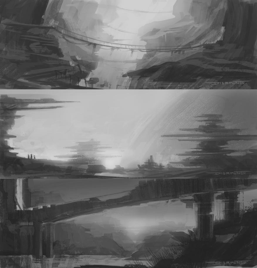
For a while I kept hearing about this magical new approach to building up compositions using custom shapes. The idea came from Sparth (if you don't know who that is...let's just not even go there) and for the longest time I questioned it's effectiveness. I generally like to block out big shapes and cut back in for detail. It's a process I've used for a while now to generate enviros and up until now it's worked pretty well.

The problem I kept running into was populating the scenes with detail and getting my shapes to read as I intended them. A rock didn't QUITE look like a rock unless I spent a few minutes slicing out all the cracks and chips, and it never felt quite natural. But this new approach to thumbnailing circumnavigates this two step process and cut's production time by more than half. Here's the thread you'll need to get started: http://www.conceptart.org/forums/showthread.php?t=201403

Below are a few of my first experiments.

I started with one shape and use that exclusively to build up a quick scene.


From there I altered the first shape painted over and cut back in with negative space to create a new custome shape. I used both of these in tandem to create the next scene.


Shapes alone stack and incredible amount of detail in literally no time. But using them together with stock/custom brushes has been ideal. The custom shapes work as a base to build up on top with brush strokes.


Which is exactly how I've started one of my key shots for my Comp. Illustration 2 class. Depending on how calculated to want to be with this method I can see it working both as a graphic white/black technique, or (as I plan to do) a basis for a full color painting.


SO! Just thought I'd share. I'm definitely enjoying this fast and messy method, and the results are great for the time it takes to produce. I'll see if I can't get a tutorial up once I finally do a color paintover. 

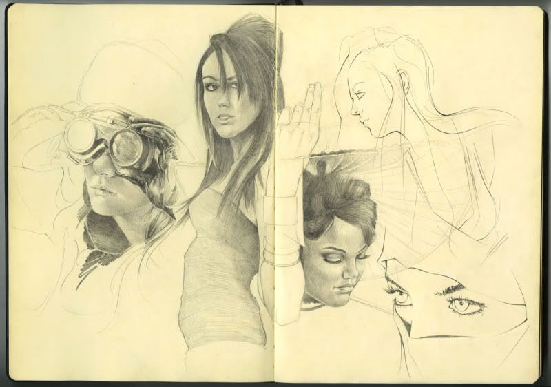
And finally broke open the new Molskine. Some renders/sketches from photo reffs.


Goggles girl and ninja lady from DA:
http://valentinakallias.deviantart.com/
http://sifu.deviantart.com/

The rest are friends of mine from high school. Some insanely talented models and one of the best photographers I know. Show her some love ;)
 
http://sinfuleyes.deviantart.com/

Have a good one!!

Sunday, June 19, 2011

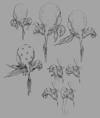
Creature Designs 1st Round

Alright I can successfully say this is my first real attempt at working with creature design. Unless you count the one piece I tried when I was in 6th grade :/


Or the dragons I used to draw back in 7th and 8th grade -__-


Anyway, I guess my point is I don't spend a lot of time in this particular design arena. But Having been through a couple of these now (with some wise guidance from Sr. Ramos :) I can definitely see the appeal. These have been a blast to create and hope that shows through in some of the work.


I'll keep this space updated with any new developments for this project but for now http://www.youtube.com/watch?v=YFk2_5RkwlA

And for anyone who WASN'T at Red Rocks last night, you missed out on one HELL of a Bassnectar show. Whomp, whomp, warbly, whomp, WHOMP!! ;)


Monday, June 6, 2011

SPRAWL Building Update

Here's a progress update from the SPRAWL team. Adam shot me another screen from one of the corner blocks to flesh out a multi-complex structure. I'm superimposing the piece on top of the original screen plate. All that's left to do is get some signage scribble in some last minute details and lay down proper color. Thanks for checkin!

Thursday, June 2, 2011

Face The Truth

Beginning stages of my first project for Grad Portfolio. Haven't decided how detailed or not I want to render this for the final. Color choice might end up changing too, we'll see after critique tomorrow! It's fairly graphic not only in the saturation/intensity of the pallet but by preserving the lineart and not blocking in the moving foreground figures it has a different style to it that I'm not used to seeing in my own work. Can't say I'm a fan of it at this point, would definitely like to introduce some more naturalistic tones and flesh out the static wall structure she's leaning up against. But for now...sleep :)

Tuesday, May 31, 2011

Gladiator Progress

Definitely need to spend more time figuring out what exactly this characters helmet will look like. It going to be a nice selling point so we're going to have to go through some design callouts and nail this one. I'm also going to need to spend more time understanding the value shifts in this area. I'm thinking my best best is to render each metalic surface as though it's brand new and highly polished before layering the grit and grime and doing a final paint pass to make everything feel worn. But as-is those highlights and shadow tones are completely off :/

I'm trying to mash classical gladiator with a Siberian setting (see Nissa character post below) so there's elements I need to drop and some I need to incooperate so these two characters look like they belong in the same universe. Right now I think they feel a bit detached from one another design-wise. BUT! I'll make sure to pull them both back together in the final stages.

Saturday, May 28, 2011

Alley Quick Sketch

Another environment paint over. Started last week with a few 3 minute warm ups to figure out composition. Showed these to the SPRAWL guys and from there Adam provided me with a basic 3D screen from the current level build. To push myself and avoid noodling around with details, I made sure to 1) save any photo crops for later in the process and 2) stop finished or not at just over 2 hours to see how far I could get.

I went through Dylan Cole's Gnomon matte video again (i think the last time was well over a year ago) to better understand indicating detail quickly and efficiently. I've had issues in the past trying to figure out how concept artists construct urban landscapes that are so heavy in detail. But after going through both Dylan and Feng Zhu's methods I see now it's really just a TON of various mark-making with photos used to support the overall structures.


I guess my underlying goal here was to see how well I could communicate an urban setting without the use of photo crop and in a relative time crunch. Hopefully I hit that mark, if not at least landed somewhere close. Haha.

Also, came back from Kung Fu Panda 2 tonight. If you haven't see it already drop everything you're doing and get to the theaters.....now!!

Friday, May 20, 2011

Nissa Preview

I'll see if I can't finish her off by tonight. Thanks for looking!

Life Painting Progress Shot

It's been fun getting back into oil painting for the last couple weeks. Our models have been fun to work with and the costuming is better than anything we've done in the past. I spent the majority of Wednesdays session working out the face. Still not quite there but we're making progress. The model expressed an interest in purchasing this work once it's finished. She said it would be a nice gift for her mother and one where she was actually clothed, haha. So hopefully we can do it justice by the end ;)


In the meantime I think I'm going to knock out the clothing/torso region this weekend. I took photo's but haven't bothered using them because working from life feels so much more gratifying. That, and various other projects have taken up my weekend hours so the painting is usually saved for our Wednesday class.

18"x24" Oil on Masonite.

Monday, May 16, 2011

HHAAANNNDDSSSS!!!!!

Nissa

For my Computer Illustration II class, our first assignment is to illustrate 2 characters. The first is some sort of protagonist and the second is the antagonist. The focus is to practice rendering a certain type of material ie: fur, scales, skin, etc. But I've started to see over the years analyzing character designs for entertainment, hell even watching people around me, good design tends to incorporate a variety of surface materials in one outfit.

So I've decided to challenge myself a bit and push a few of these elements into both characters. The story I came up with involves a frozen landscape (I'm thinking Siberian plains) with a gladiator theme. The protagonist is some sort of female warrior and her opponent.....is yet to be determined.

Initial gestures and a semi-finished sketch of Nissa. Too tired to mess with hands and feet tonight :P


Already started thinking of a color scheme/rendering style so I'm hoping this all pulls together fairly well for the final piece. Getting pretty excited :)

Sunday, May 15, 2011

New Post For Old Work

Wanted to share some older studies that I haven't posted here before. All environment related, sketches and color keys some reffed and some without.

These were some basic warm ups for a project I was fortunate enough to be apart of with Raul RamosBrent Pickrell, Stephen Ehrman and Jayson Miller. It didn't make it quite as far as we would have hoped but it definitely gave us all an insight into communication and working in a pre-production pipeline. I have a few other pieces from that time that I'l post in the coming months.

First set was 20 minutes a piece, second set took 45 min - 1hr.


These were some weekend studies based off various photos I found scouring through my friends Facebook photo albums. The video time lapse can be seen here.


This next set was fun to experiment with. A while ago I decided to fill 2 pages in my Moleskine with nothing but black and white environment thumbs. It was a quick way to practice composition and break down the value patterns into fundamental shapes. From that list I picked off a handful and spent 30 minutes or so laying in values and playing with the lighting. Definitely learned a lot working with these.


Saturday, May 14, 2011

Small Update

A few quick renders of the building silhouettes from break. I've been busy getting a logo finalized for a new client, and school has started back up so I'm taking advantage of every assignment I get to  create another piece for the portfolio.


Between the Fubar and Sprawl mods, class assignments and personal work I should have a more well-rounded portfolio. That was something I was missing a few months ago, a nice balance between characters, environments and vehicles/weapons/props. So long as I can keep up with the sketchbook and continue producing development work AND illustrations I'll have the confidence to start submitting to the industry once and for all. And by that point I'll be able to showcase some new work that hasn't been seen before in my final grad show...

Thanks for checking!

Monday, May 2, 2011

Last Post Over Break

Haven't posted much in the past week or so. Been busy getting through an editorial piece for my dad's department, a new logo for the children of Africa as part of a new clothing line (information to follow in the coming weeks) and making more headway on the album artwork.


On the mod side of things, Sprawl has been working hard to get the demo out in the next few months. I'm still in the middle of getting through the city piece. By that I mean I haven't touched it since last post and need to set aside a solid day to finish up. Hope to make that happen this Friday. In the meantime I knocked out some quick and simple building silhouettes for the first level. Should have a couple of these fleshed out with the city so they work together on the final style sheet.


Also, if anyone is interested, we're looking for a few additional concept artists to help with the 2D side of things. If anyones interested feel free to e.mail Rui (with portfolio samples) at: rui.coelho86@gmail.com or check out the CA Thread, Blog, or Forums.

Fubar has had a bit of a challenge gaining members as it's just myself and one other individual drawing up designs. Just the beginning stages of James character thus far:


My progress took a hit with the cold that I now have (thanks little brother ;) and working on these additional projects. Its been a blast! But definitely a lesson in time management. Unfortunately that meant the 2 personal works I wanted to have completed before school started never made it. But with my new term schedule I'm hoping to have enough space to get focused on personal work for the portfolio.

A few people on deviantART were asking that I post a tutorial on the Cartographer piece I made a few months ago. Finally got around to it over the weekend:


Had a nice sketch day with Raul RamosJon BakerBrent Pickrell, and Vic (someone tell this kid he needs a blog already!!) over break. Was fun getting to sit down with everyone and just observing the people around me. I don't do that NEARLY often enough. Also gave me a chance to congratulate Raul in person on his new internship at http://www.direwolfdigital.com/!! I'm stoked to call this guy my friend and wish him nothing but the best. Can't wait to see the work he does for this new company because it's gonna be KILLER ;) Plus I owe him a sack lunch.

And Osama was killed yesterday so that's......news.

Laters!

Thursday, April 21, 2011

Sprawl city update

Thought I'd post a brief update on the first piece I'm working on for the Sprawl mod. These guys push non-stop 24/7 so there's always something to do. Everyone on the team is constantly giving and receiving feedback round the clock (I think there's members in something like 5-6 countries?) so the work gets refined rather quickly. Great environment to work in.

This first piece I started just today actually. Had to push it off for a bit while I tackled the Fubar characters, so this stage represents 50% completion. I'll make sure to post a tutorial once it's done sometime by the end of the week.

For now, I started by building a basic block-out in Sketchup from a top-down view Adam provided the team a while back. I took a few shots and played around with some values in the early thumbnails.


But my build wasn't nearly as accurate as what the team had already begun to construct. So Liam shot me a few screens of their current model and I used this to begin the paintover process.


Thanks for looking! Like I said, should have this guy finished by the end of the week. I need to get through some more album revisions and work on a logo for a new client for tomorrow, but my late nights from 10-2 have been set aside for personal work/mod projects. I'm really enjoying this new sleep schedule outside of classes..

Wednesday, April 20, 2011

Quick Sketch

Wanted to give the mod projects a break and get started on an idea I've had milling around for a while now. This will hopefully be 1 of 2 personal illustrations I complete before heading back for my final term this summer. The primary goal I have for this piece is executing multiple light sources coupled with multiple figures.

I took some time to sit down and watch Dave Finches dynamic figure drawing workshop before starting this. He has a nice loose approach to quick sketching that I'd like to get more in tune with. Definitely helped to get some of these basic block in's started.

Thanks for checking! Should have an environment to post soon for the Sprawl team ;) They're doing some nice work getting multiple assets together in tandem so we'll see how the rest of the artwork comes together in the coming weeks.

Tuesday, April 19, 2011

Sarah Full Ortho (Almost)

Ahhhhhhhh! Almost there. This whole process has really taught me a lot about design coordination and time management. I definitely need to get more structured lines out of my sketches so I don't save ALL the functionality questions to be answered in the final stages of development.

Still missing her headset. I think what I;m gonna end up doing is a full callout sheet with facial expressions and prop designs, because those seem to be the two areas that are lacking in these static poses.

Saturday, April 16, 2011

Sarah: Front/Back Orthos

Man, this got more intense than I expected. It's one thing to quickly sketch out a design from one angle. It's entirely different to make it WORK in the round. No place to hide your flaws. LIKE FACES FOR EXAMPLE!!

Just the front and back for now. Should finish up the side views by tomorrow. Then i can move onto James. Damn, i had expected both of their turns to be done by today :/